UX Case
UX Design Process
Why:
I was asked to redesign the user journey to enroll new customers on a digital process applying for a credit card, a digital account, and a payroll account. The problem was that the first version of the flow needed to perform better, the conversion rate required to be higher, and they needed guidance on where to make some adjustments that allow a +15% growth.
How:
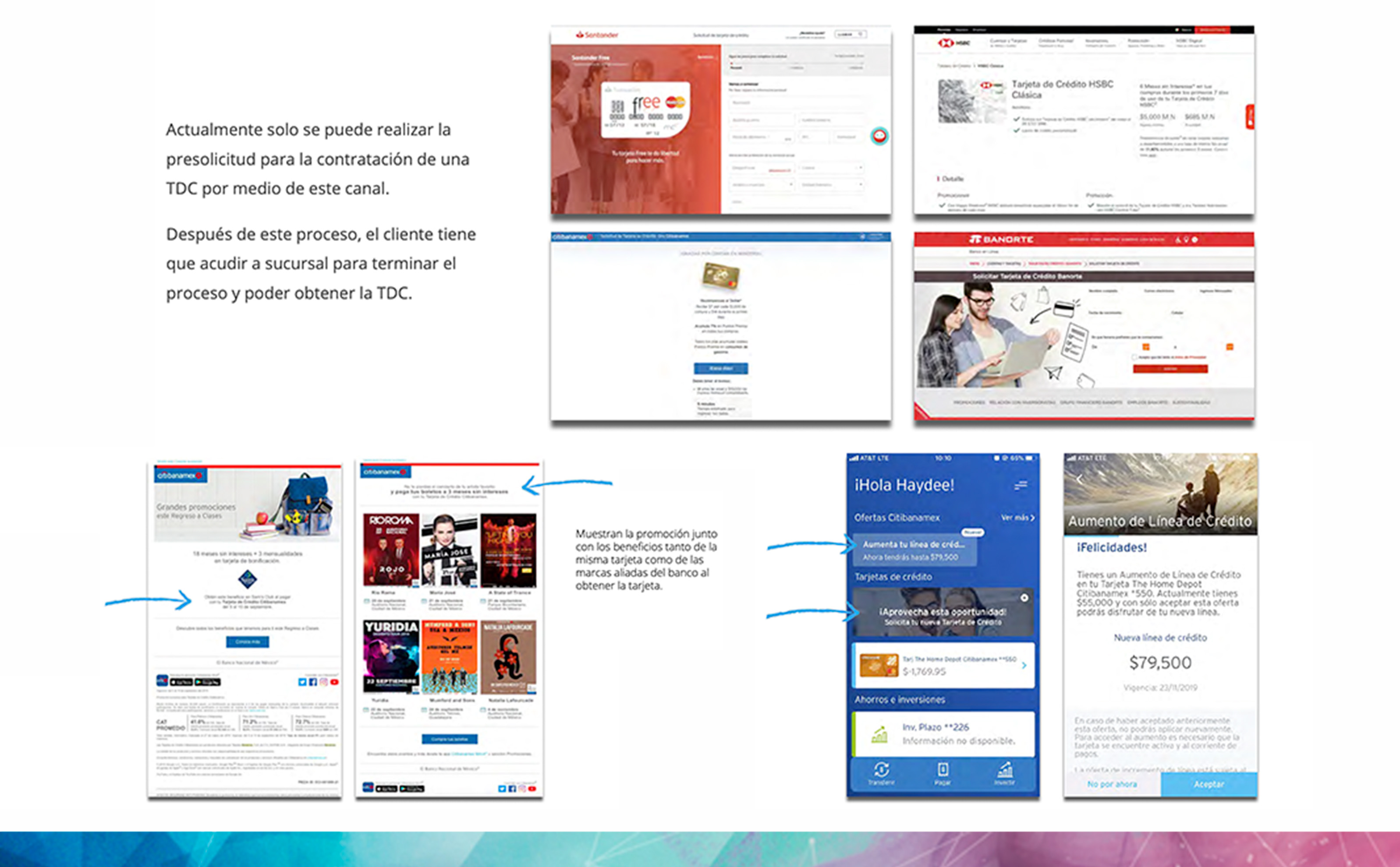
Research - Competitive Analysis
I started by performing research, analyzing what other banks were doing, how their process works, and how their first contact with users is; I also examined the quantitative data from our funnel to find out the possible “whats.”, and then with this information I went back directly with the users and tried to get the "whys" on 1:1 interviews.
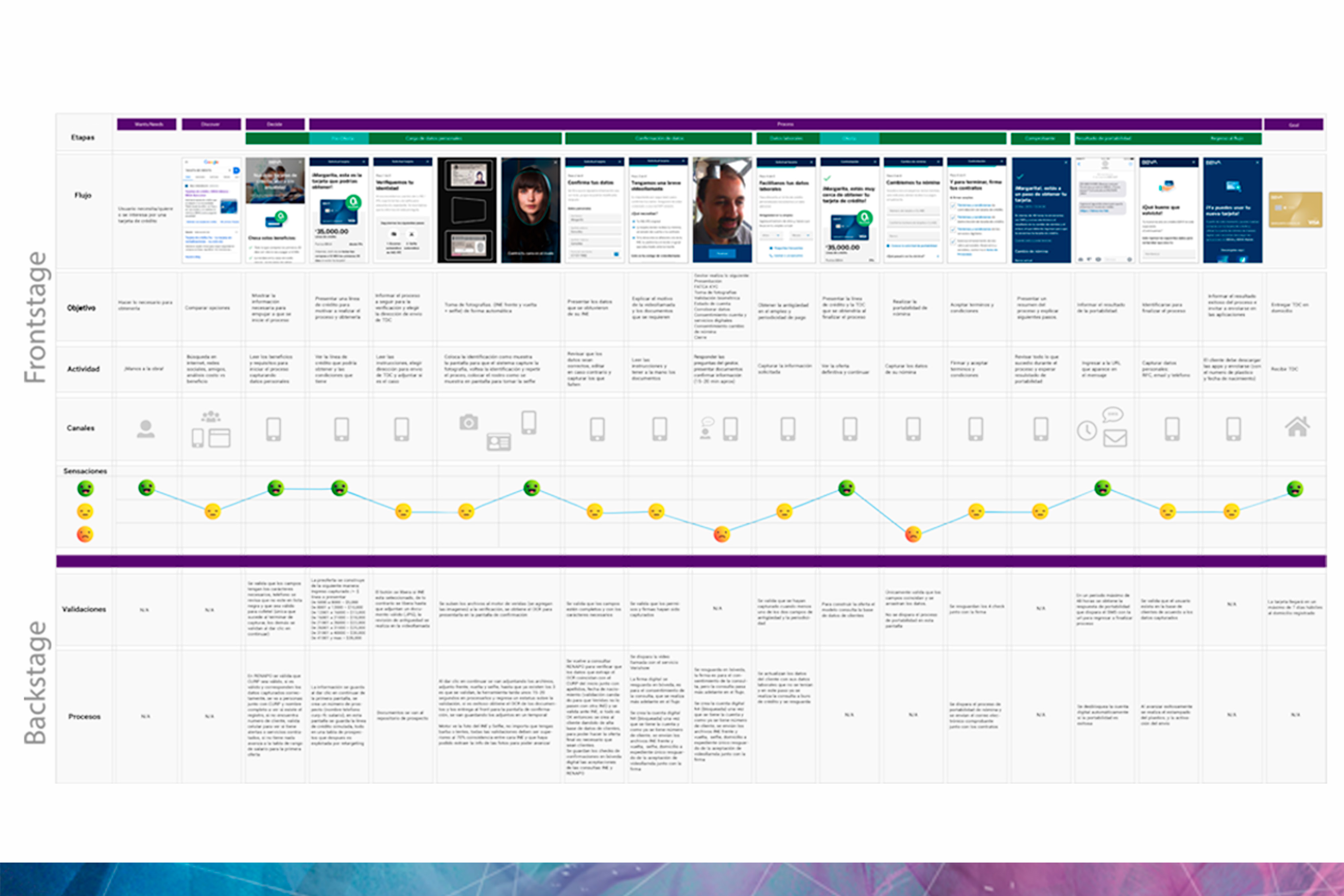
1:1 Interviews and Journey Map
With all this info, I got a better picture of the real problem, and the journey map allowed us to see precisely where the user was struggling the most and allowed us to make design decisions for the redesign of the flow.
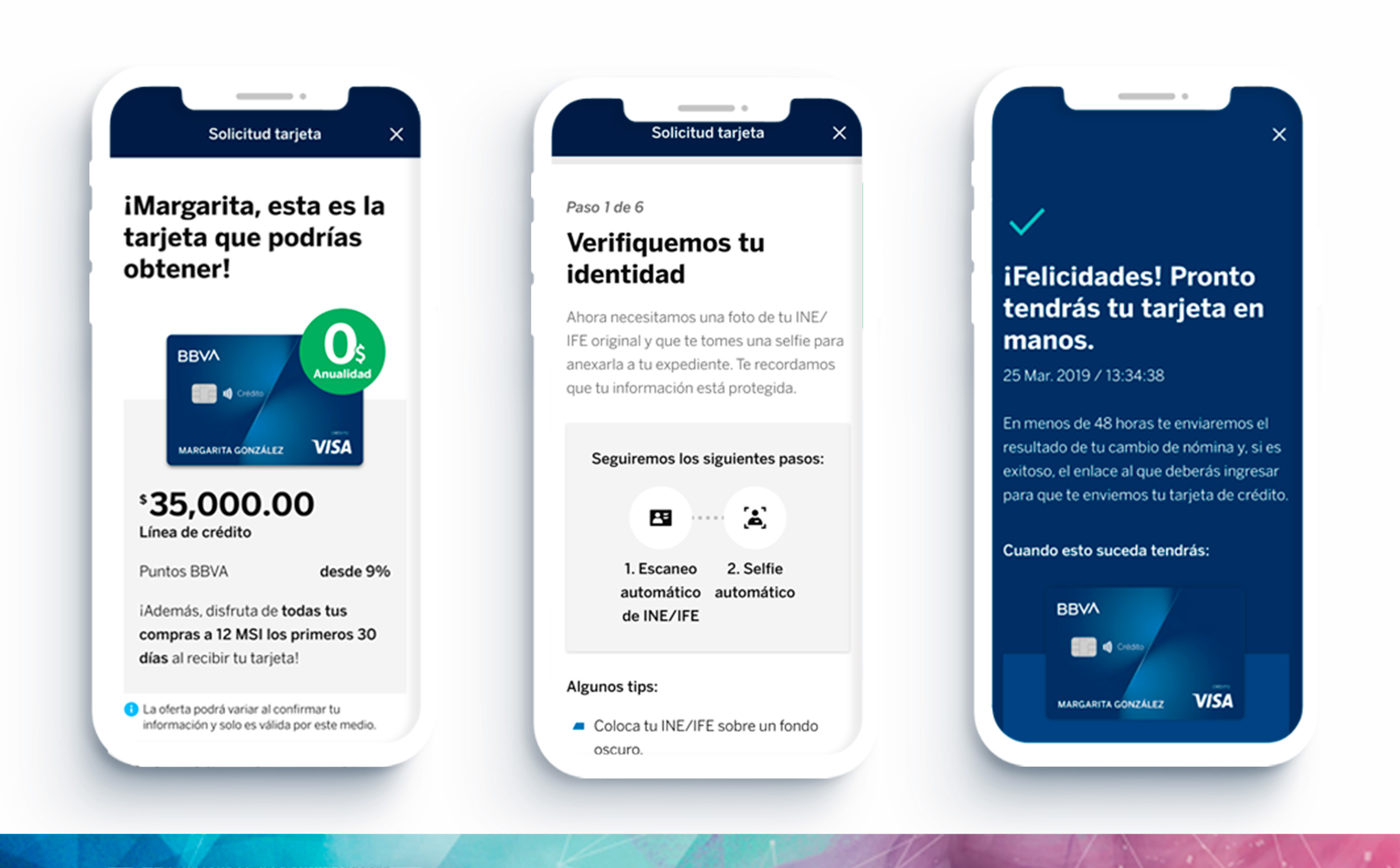
Redesign
And now, it was the moment to apply all this information to screens and UI components. This project was designed on sketch; here, I collaborated with teammates from Spain because they were working on new graphic guidelines.
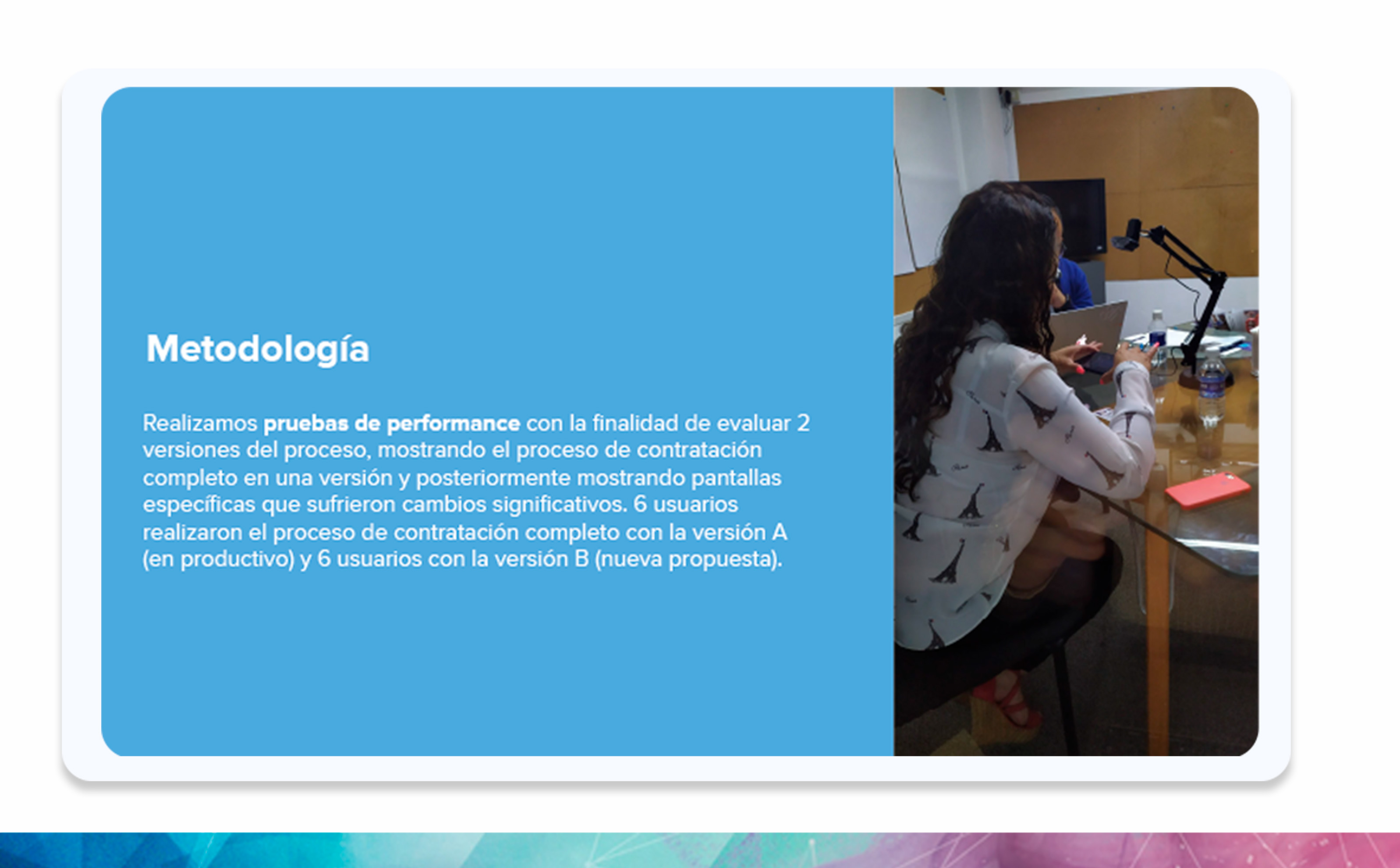
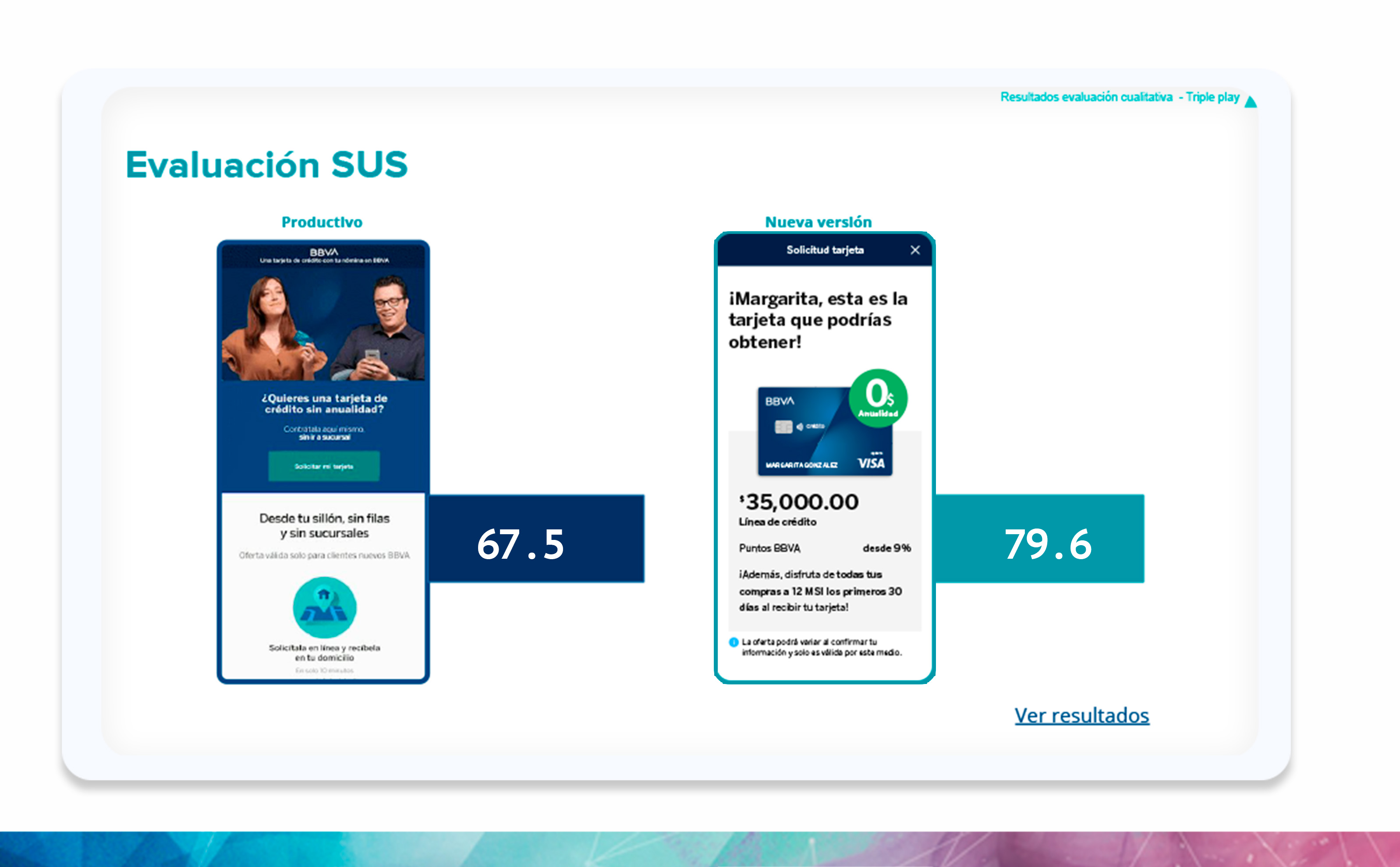
A/B Testing
Finally, I performed user testing by showing seven users only the A version and seven users only the B version to evaluate both and know which one was performing better.
What:
In the end, the flow ended up being different from the original, thanks to the insights found in the discovery process and the feedback on the A/B testing. All these changes help us decrease our bounce rate and increase our conversion rate by 18%.